Any online business needs a well-designed payment page. The merchant can get the payment page by connecting the payment gateway. It is software that organizes the online payment process using credit and debit cards.
Even if the payment gateway covers all the needs of the business, this does not mean that the transaction will be completed successfully.
The data shows an incredible percentage of unsuccessful transactions:
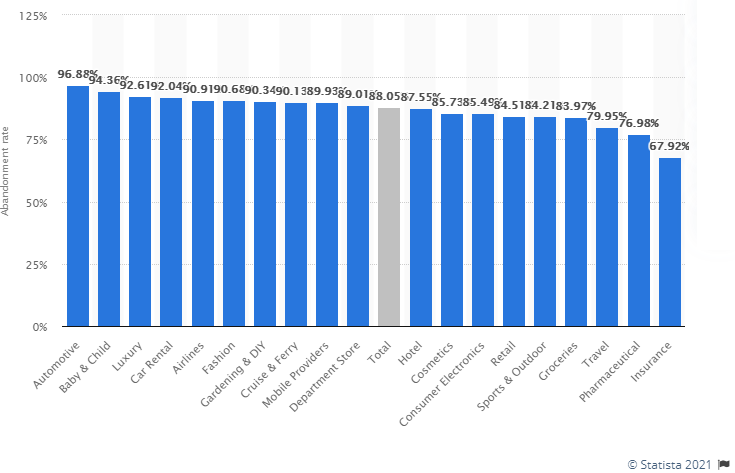
More than 21% of bounces are the result of a poorly designed payment page.
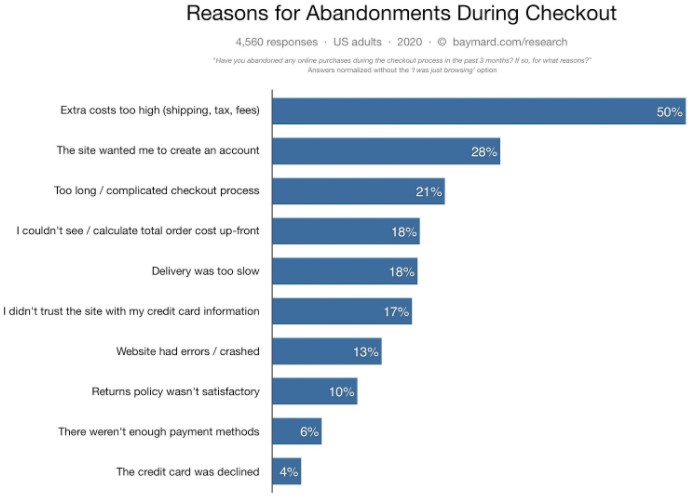
Most companies concentrate only on the homepage of the site, overlooking the design of the payment process.
Don’t do that.
How to optimize a payment page?
To increase sales and reduce the number of unsuccessful transactions, the payment page can be optimized in several ways:
- Usability;
- Financial information security;
- Use of additional marketing tools.
Usability
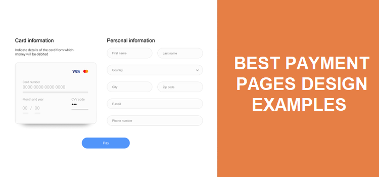
The need to use the principles of usability when designing website interface design is an axiom for any modern online entrepreneur. The same principles should be used when designing a checkout page. The primary subject of analysis in this case is the number of actions/steps from the moment you click the pay button until the payment is completed. It is desirable to reduce the number of steps, structure them logically, and arrange the necessary elements in a sequence that is convenient for human perception. The buyer must understand exactly which button must be pressed at a given time to move towards the completion of the purchase.
Next – Input fields. By default, payment providers provide a single standardised payment page, which offers users to fill in a certain number of fields, entering a phone number, etc. But why burden the client with filling in unnecessary information at the time of parting with money? Someone is in a hurry, someone will start to doubt, someone will be mistaken. The result is an unfinished purchase. Therefore, it is advisable to reduce the number of input fields or use the autocomplete function.
For services that have many regular customers and repeat purchases there is an optimal solution. For example, discount services, online ticket dealers, MLM companies. It will be convenient for their clients to use recurring payments, which will save them from the constant need to enter card details. Starting from the second purchase, in order to pay, you just need to confirm the desire to make the payment with the same card as the last time. The purchase takes place in two clicks, which speeds up the buying process, increasing the conversion.
Financial security
The page with the payment form must be generated individually for each payment. User data must be reliably protected from intruders and transmitted to the acquiring bank in encrypted form using the TLS (Transport Layer Security) cryptographic protocol. Payment security must be confirmed by Payment Security Industry Data Security Standard (PCI DSS). And most importantly, the customer should know that their money is secure. Whenever a customer’s billing and personal information is involved in the checkout process, remember to demonstrate all the precautions you and your payment partner take to keep them safe.
Additional marketing tools
Offer the customer a related product right on the checkout page. To buy an additional item, you just need to put a tick in the right place. The amount to be paid will automatically increase. Clicking on the pay button initiates an enlarged financial transaction. We all make impulse purchases often, supermarket checkout areas are a great example.
Best payment page design examples
CCBill
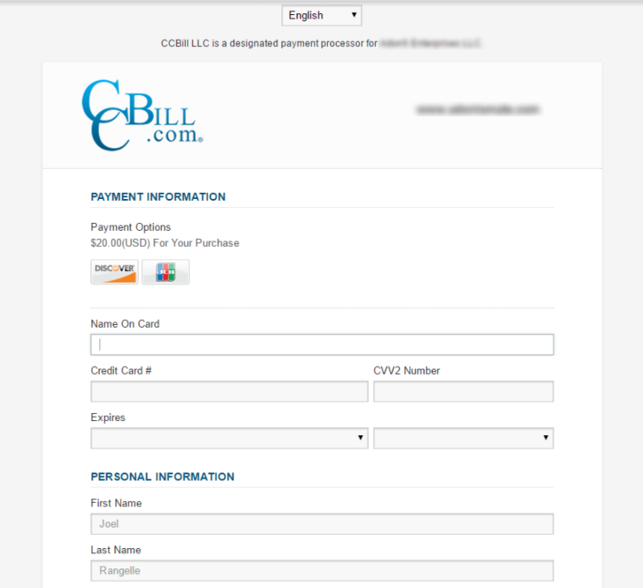
Founded in 1998, the company serves over 30,000 merchants worldwide.
System advantages:
- Availability of major payment methods and processing of popular credit cards;
- Payment processing is done via bank transfers, electronic checks, credit and debit cards.
- The company accepts high-risk merchants, subscription businesses, gambling and adult businesses.
Amazon Pay
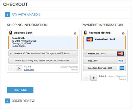
Paying with Amazon Pay is beneficial for both the user and the merchant who uses their checkout button on their website, firstly, because the sales process is much simpler and makes it much easier to get customer data. : During login, you will automatically receive the buyer’s name and verified address.
The process of adding this online payment button via the Amazon Pay API is very practical, even the company itself has published several instructional videos that make the task a lot easier and can be viewed on the Amazon Pay channel.
Alipay
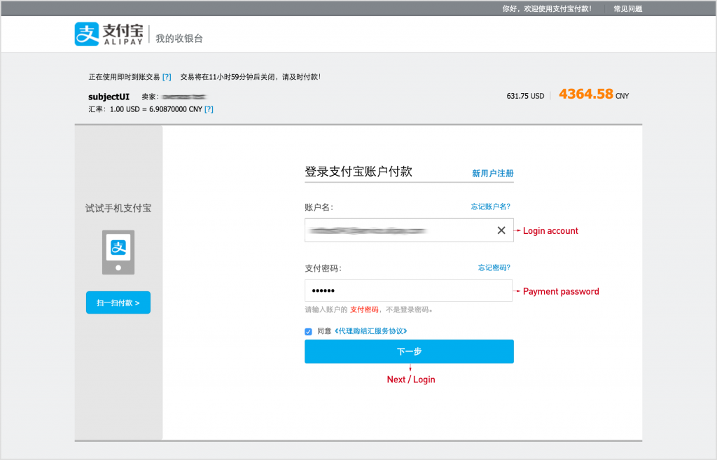
Alipay is one of the largest payment systems in the Alibaba Group. The main task is to be used within the group for Alibaba products, as well as for settlements with other companies. The system cooperates with dozens of financial institutions, including Visa and MasterCard, large international and regional banks.
Advantages:
- Simplified payment procedure without entering card details;
- High reliability of transactions;
- Convenient interface;
- Minimum commission on sites with Chinese goods;
- No payment limits.
Square
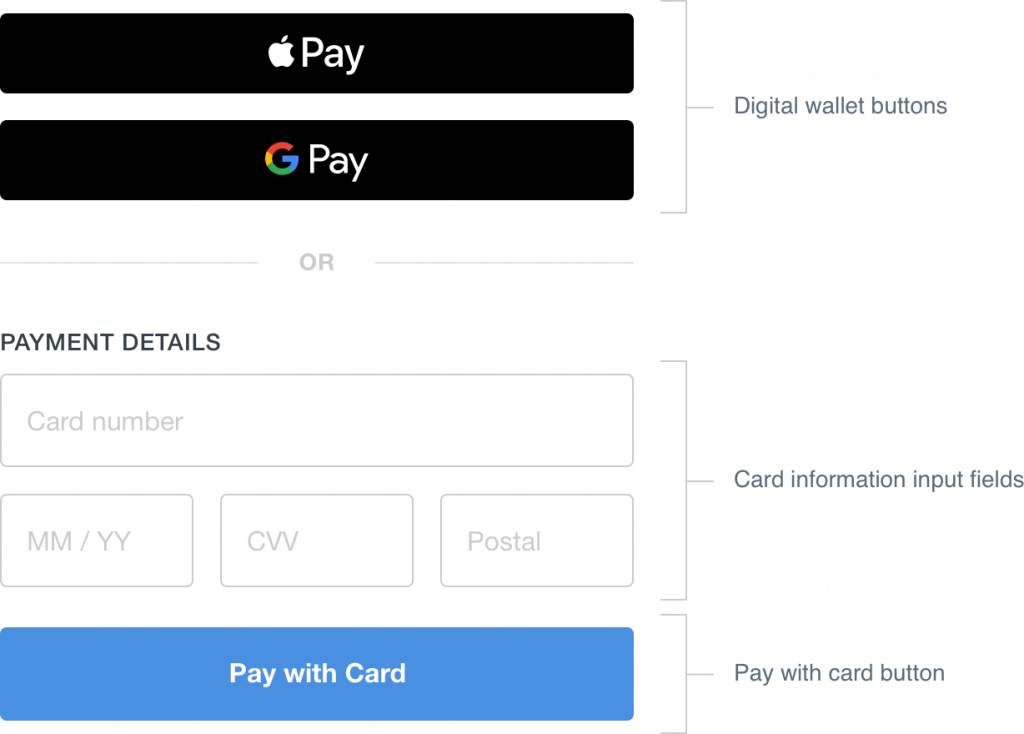
If you want to start accepting online payments but don’t have an online store, Square can help you set up one. Square has partnered with easy-to-use site builders like Wix, Weebly, and GoDaddy to help you get online and start selling. Square offers API integration, so you can accept payments from your website. It’s designed to save you the hassle of keeping track of your online transactions by allowing you to track all of your sales from one place.
Advantages:
- Provides next business day deposits;
- Real-time sales reports and analytics included as standard;
- Fully PCI compliant;
- No setup or monthly fees.
Transferwise
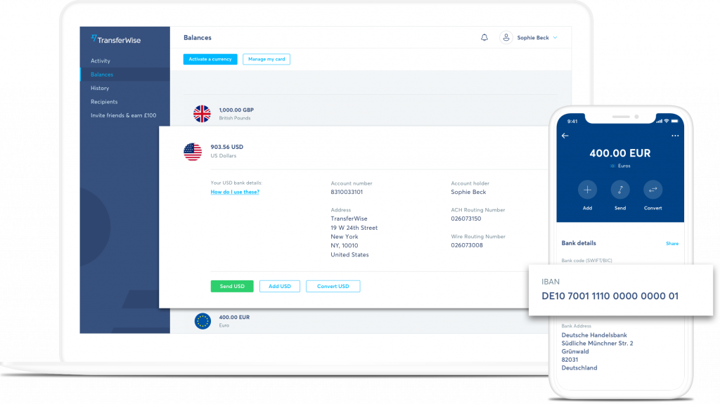
TransferWise has gained its popularity due to its low fees: you will pay from 0.35 to 3% for converting any currencies, and the site has an online calculator that will quickly calculate everything for you. You can store and convert your money in more than 40 currencies, and cash withdrawals will be free if this amount does not exceed $ 250 per month, and anything higher is 2%. The payment system is famous for its excellent and responsive support service, fast transfers and a lot of satisfied reviews.
The bottom line
Summing up, we would like to emphasize once again the need to pay attention to details that can positively affect sales. The payment page is an important element in the interaction between the buyer and the seller.
Design + usability + innovative marketing tricks are the main elements, the correct organization of which will simplify the buying process for customers. It is necessary to analyze the current state, study the capabilities of existing payment partners and choose the best solution. Anything that we do not believe, we do not control. Therefore, it is also important to provide benchmarks for comparison and analysis sometime after the implementation of the changes. The best indicator of the correctness of the chosen solution will be the improvement in the ratio of the formed baskets to the paid ones. The buying process will be simplified, customer loyalty will increase, and revenue will increase. What else can a modern online entrepreneur dream of?
